Walking Through ICFF 2016
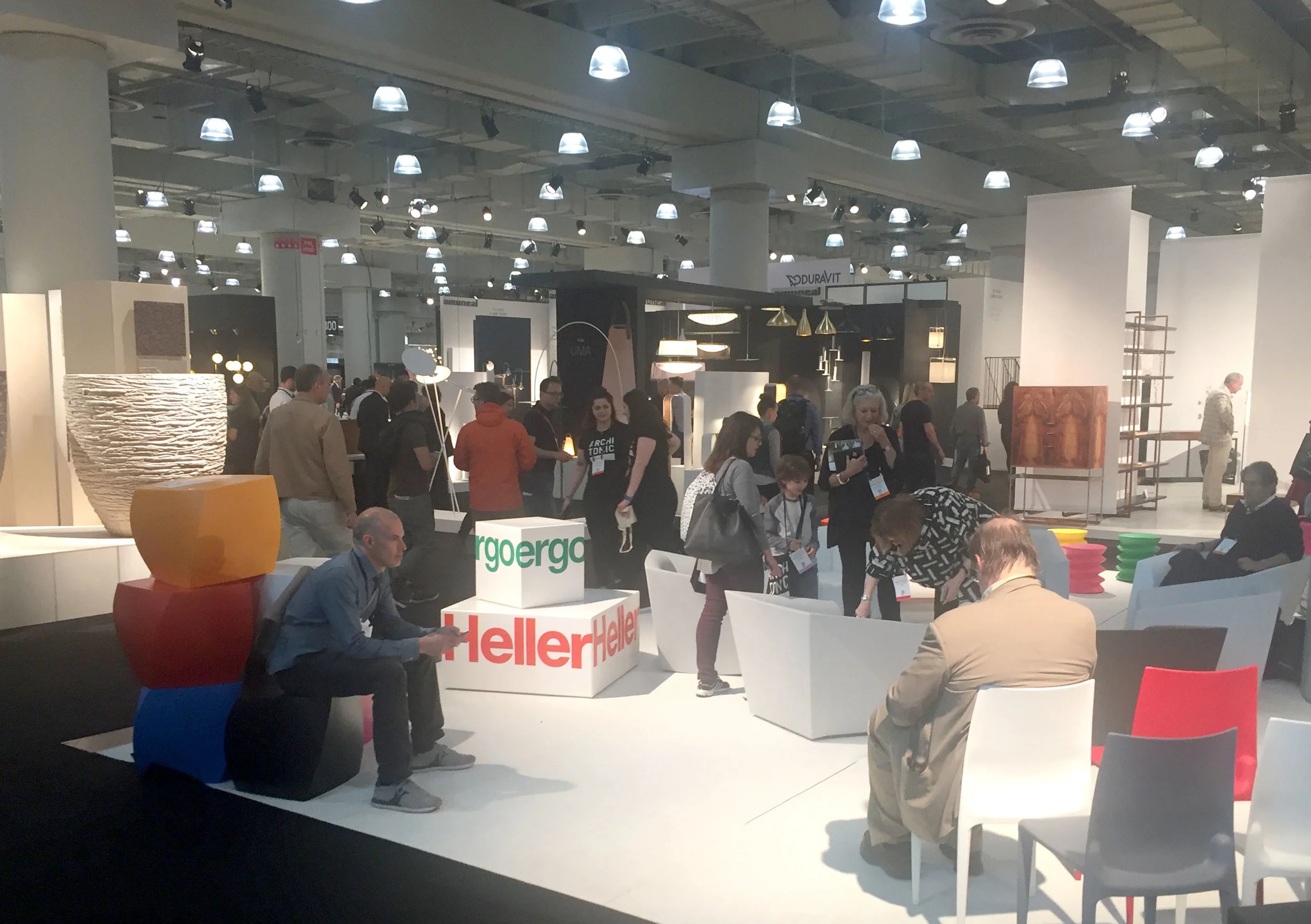
What we saw at this year's largest and oldest show. It seemed as though a lot of the the fat has been cut out of the fair, with much more of the displays being on point for the New York market. With so many offsite events and shows cropping up, ICFF needs to up its game to remain relevant in the long run …
Kreoo, an Italian firm working in marble had some interesting tables.
Loved these simple lucite pieces and color way from Nobel Truong
Loved this weird juxtaposition of found cabinetry and hardware for a playful design by Ana Arana.
These expanding connected lighting modules from LightArt reminded me of the MTA Subway maps of the 1970s.
Volk continues to put out competent work that's on trend.
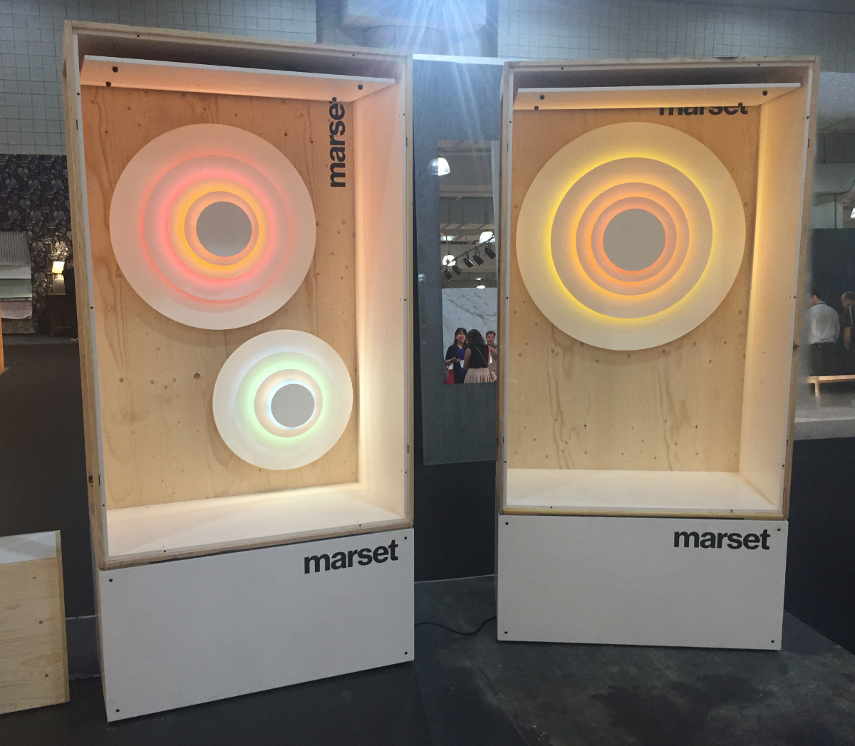
These lights and the display by Marset were great.
I was quite taken with this sofa from Egg Collective.
I discovered a new company (to me) in Yield.
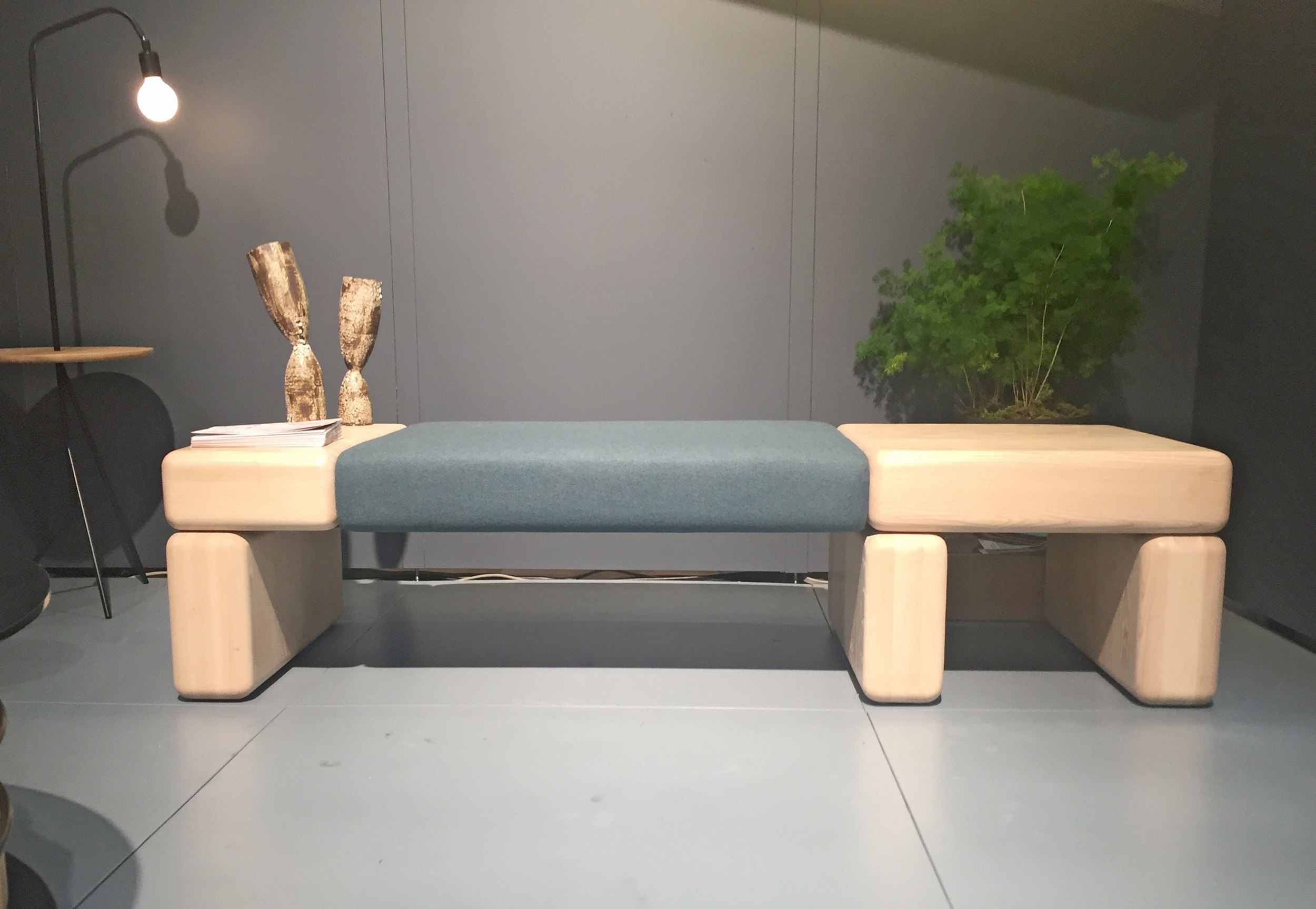
The shapes and soft forms of the Pillowy Bench by Hinterland Design spoke to me.
The kids aren't really designing + building a lot of simple, practical things anymore. Good on Norman Cramer for making this extremely useful design.
KGBL of NYC had this nice sofa and a few other smart pieces.
Wüd Furniture collaborated with reclaimed flooring manufacturer Madera for this intense booth.
Antolini always impresses with their over the top booths.
Dunn Studio of Rhode Island had an impressive amount of work in both hardwoods and metal lighting.
Good Thing was a nice visual break with their fun colors and quirky product design spread.
I was surprised to see that David Rockwell worked with Rich Brilliant Willing to come up with a line of lighting fixtures … but after thinking about it for a few minutes it made sense.
Uhuru launched a new Contract line, and brought a couple of pieces to remind us all what they really excel at.
I was quite taken with this sofa from Bernhardt Design.
I really loved this desk from Stickbulb - it was only built for the show, but it looks like a stack of reclaimed wood however in actuality it's a functional place to store things.
Check out this wall by Amuneal!
This tall cabinet from Skram is great
Props to Andrew Neyer for his Stuff Collection, one of the most fun things I saw at ICFF.
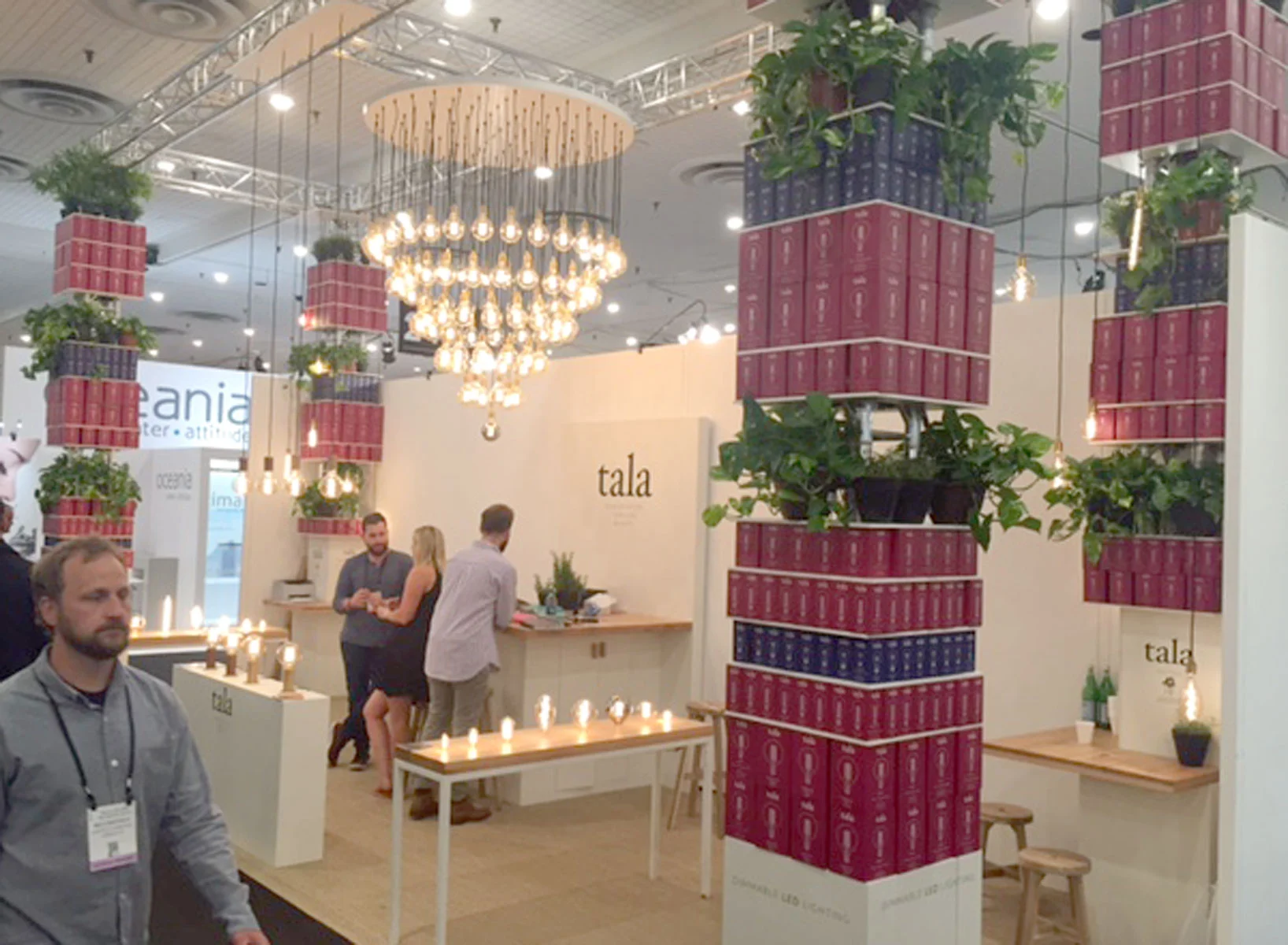
I've included Tala just because I really liked their booth, with the columns made of plants + boxes of their lighting products.
I met Ali Siavoshi a few years ago at ICFF, when we had a booth. Now he has one of his own. He has the best website name ever! ALIALIALI.COM! Also, I have a sketch somewhere of this exact lighting idea.
I'm a big fan of Campaign's website … the furniture, not so much.
Really great work by Alice Tacheny. Check out her site.
The subtle shades of these quilts by Thompson Street Studio are on point. I want one.
That wraps up what I personally saw and took note of … it's always interesting to look around online at other blogs and magazines saw—most of the time mine finds are completely different!


